NYSB Mobile
12345
12345
|
I am almost always on my mobile. What seems to be the issue with the site and mobile phones?
|
|
Administrator
|
Sounds like you are not having issues, which is cool. I've had complaints about loading images etc and while I can do most stuff easily on my phone, I assumed that my familiarity with the site helps me in ways that others might not experience. While I would always wait to get to my laptop before doing a significant post like a TR, I sensed that younger folks were not happily with what they see on their phones.
"You just need to go at that shit wide open, hang on, and own it." —Camp
|
|
Administrator
|
Thanks for this JT. I've stopped updating or promising and an NYSB upgrade because it has been so painfully slow. However I'll give some info as it seems time. I work for a company that buys a lot of web development. The guy that I want to do the work to make the site mobile estimates the work at $4-8k. This is beyond my means. Why not use a free template? The site may look pretty simple but there are dozens of customizations built in. (Think about how many pages have unique sidebars.) Also the amount weather data we load requires some special treatment to keep the pages from slowing way down, especially on storm days. (Think about how many people hit that radar shot during a nor'easter.) Another idea I am hanging on to is preserving the forum. It would be much simpler to start a new one, but I'd rather not loose the content. Some forums like SJ keep the old content in the old form where you can read it but not post. That is less than ideal, for several reasons. We've worked out a trade of sorts. But the downside of trade is that it gets bumped by paid work. There has been some progress lately but I can't promise a completion date.
"You just need to go at that shit wide open, hang on, and own it." —Camp
|
|
Administrator
|
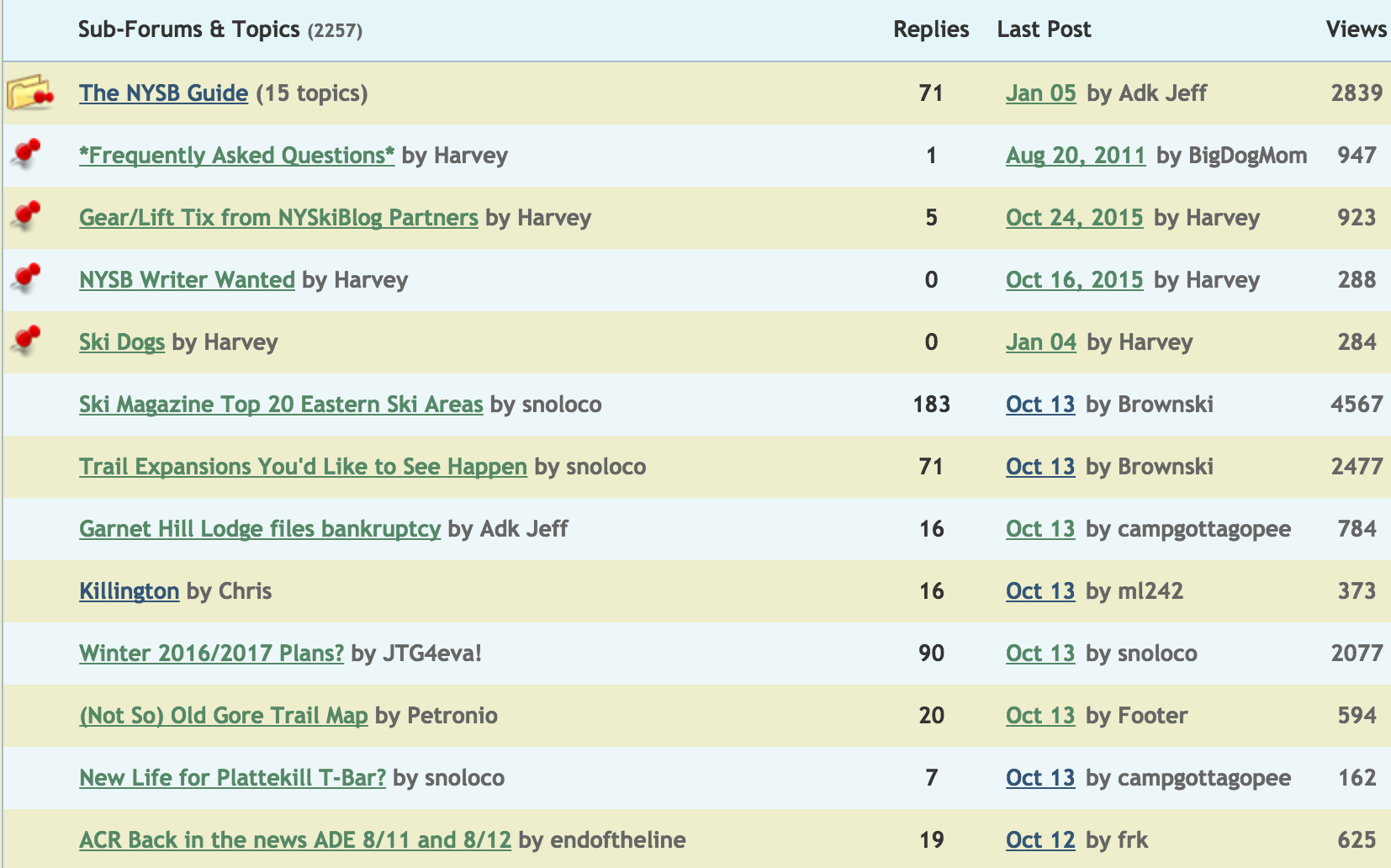
I may have to (temporary) kill either the Posts or Topics column. Does anyone care more about one or the other? Or either?
 Replies and Views may have to go too:  I know it's not even close to ideal. There's a chance I may be faced with the choice or going responsive (mobile friendly) on the whole site EXCLUDING the forum or struggling through another season stuck in the last century. On a somewhat related note, if snoloco would bet me $4000 that Gore's main base is closer to Albany than the Ski Bowl I could solve all these issues quickly.
"You just need to go at that shit wide open, hang on, and own it." —Camp
|
|
Views and replies column are not that helpful. I like the last post column...I find it user friendly.
|
Agreed.
We REALLY need a proper roll eyes emoji!!
|
|
last post should have a time stamp, not just yesterday's date if it wasn't today.
|
|
Administrator
|
That's not going to change as long as we are on nabble. How long that is remains to be determined. Forum will probably be down a few days when we switch, not inclined to do that in season. To me last post is critical, I won't remove it even if it breaks the layout.
"You just need to go at that shit wide open, hang on, and own it." —Camp
|
|
In reply to this post by Harvey
I use Last Post. The others . . . not so much.
|
|
Administrator
|
As mentioned earlier in this thread, I'm trying to get the forum to fit on a small screen (mobile phone vertical view). I figured out how to remove some columns, kind of pumped. This is all in prep for a switch to a responsive framework which will happen... well not saying when since I have no idea.
The forum is going to look kind of sparse on desktop. Long longterm we want to switch to modern forum software, which will undoubtedly be a significant disruption, I'm hesitant to try that during the season which is upon us. Any feedback or quirks you see feel free to post them here. Be nice, doing the best I can.
"You just need to go at that shit wide open, hang on, and own it." —Camp
|
I like sparse.
Love Jay Peak? Hate Jay Peak? You might enjoy this: The Real Jay Peak Snow Report
|
|
Administrator
|
Any one using any of the following devises?
Samsung SM-B360E Samsung SGH-A847 Rugby II Spice M6800 Flo Opera Opera Mini for S60
"You just need to go at that shit wide open, hang on, and own it." —Camp
|
|
Administrator
|
Barring any major issues (which honestly is probably 50/50) we are going mobile in the next two hours.
When we push the new site live there may be some disruption as it propagates. You may see the site switching back between old and new, or other weird stuff, for a while. In addition, even if all goes as planned you are likely to find issues. The magazine is pretty well done, but there is a lot of work left to do on the directory. If you see issues (maybe starting tomorrow) feel free to post them in this thread. The FORUM will remain on Nabble for now. Once we think the rest of the site is stable, we are going to begin to migrate the forum. More details on that as we get closer. I am pretty damn excited, I hope it goes as planned. I realize this post technically does not belong in The Woodstove. I will move it in the next few days.
"You just need to go at that shit wide open, hang on, and own it." —Camp
|
|
Per your own rules, this should have been moved to off topic years ago
Just say'n 
Don't ski the trees, ski the spaces between the trees.
|
|
Administrator
|
I moved it from the OT about ten minutes ago.
Peetex this is like going into the maternity ward while a woman is giving birth and telling her that her lipstick is smudged. Go accomplish something and then come back.
"You just need to go at that shit wide open, hang on, and own it." —Camp
|
|
Administrator
|
Looks like this is pushed to tomorrow am. We found a corruption in the database.
Brownski, I'll post your article as soon as things look stable.
"You just need to go at that shit wide open, hang on, and own it." —Camp
|
|
Administrator
|
If you are so inclined, please post any bugs you find here. Thanks.
"You just need to go at that shit wide open, hang on, and own it." —Camp
|
|
Looks terrible on my phone in my preferred vertical mode.
|
|
Administrator
|
I'm assuming (hoping too) you are referring to the forum.
As mentioned above the forum is next. Hopefully less than a month. At that time it will be fully responsive to mobile. Basically in vertical you can't get to it all. Our choices: Live with horizontal phone use for a few weeks, or delete posts and topics columns (which would also be gone on desktop). I am not POSITIVE that would help but we can try it.
"You just need to go at that shit wide open, hang on, and own it." —Camp
|
|
It looks pretty good on my mobile. Galaxy S5 w/Android 6.0.1.
The forums don't look too bad either - breadcrumbs have a cascading look when you go into a category (e.g. Summer Sports). When a "quote" or two is used, the phone is looking for more space horizontally. They look better horizontal. I haven't spent long on it, but good work!
Sent from the driver's seat of my car while in motion.
|
«
Return to Off Topic
|
1 view|%1 views

